Every CricRover match report is auto-generated from live scorecard data and enriched with proprietary analytics. Here's a section-by-section breakdown of what each part of the report tells you and why it matters.
1. The Match Card Header
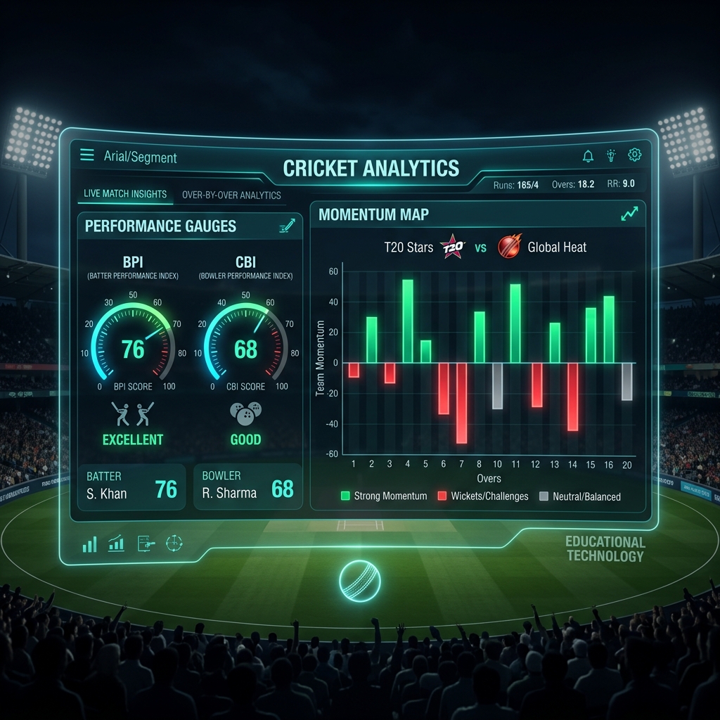
At the top of every report sits a dynamic match card showing both teams, the final scores, the winning team (highlighted in green), and the match format and venue. The card also shows the BPI and CBI scores as badges — these are the headline analytics for the match.
2. The Lead Paragraph
This is the executive summary of the match. Written automatically from scorecard data, it tells you: who won, by what margin, the venue, and highlights the standout batter and bowler with their CBI and BPI scores. It's designed to be readable in under 30 seconds.
3. Batting Highlights
The top batter from each innings is analysed in detail: runs, balls, strike rate, boundaries, and their CBI score. The CBI section explains why the innings was significant — was the batter scoring at the right time? Were they exceeding the required rate?
4. Bowling Analysis
The top bowler from each innings is presented with their spell figures (overs-runs-wickets), economy rate, and BPI score. A BPI above 70 indicates a genuinely dominant spell.
5. Key Moments (Commentary Highlights)
Where commentary data is available, the report includes a curated list of key moments from the match — wickets, sixes, and milestones — with the exact over and ball number. This gives you the narrative arc of the match at a glance.
6. Run Rate Chart
The SVG run rate chart shows runs scored per over for both innings side by side. It reveals where pressure built, where boundaries flowed, and which phases of play were most decisive. Green bars indicate overs where boundaries dominated; grey bars indicate dot-ball pressure.
7. Momentum Map
The momentum map summarises the overall character of each innings — dominant batting, restrained batting, or contested play — based on the aggregated CBI and BPI data across all innings segments.
💡 Pro Tip
Compare the CBI of the top batter to the BPI of the opposition's best bowler. If a high-CBI innings coincides with a high-BPI bowling spell, you're looking at a true head-to-head contest that was genuinely pivotal to the match outcome.
CricRover match reports are auto-generated within minutes of match completion using live data from international cricket APIs.